Conducted research with 30 participants and redesigned LiHO Tea’s end-to-end membership experience by mapping 7 brand touchpoints across digital and physical channels. From app onboarding to in-store ordering to post-visit loyalty. Lastly, presented directly to the founder which helped identify tangible avenues for investment.
Founded in 2017, LiHO is a well-loved bubble tea brand in Singapore. Its name a local slang for “How are you?” Despite strong brand affinity, LiHO’s existing offerings did not align with the preferences of their core target demographic: young women aged 18 to 25. The brand had growth potential within this segment but no structured way to reach, engage, or retain them.
The brief was to enhance 3 to 8 aspects of the brand experience to make LiHO more appealing and relevant to this audience, and to present a growth strategy to the founder that was grounded in user insight.
My Role
I was part of a 4-person team working on this project over 4 months. My role covered UX research, mobile UI design for the LiHO app, and contributing to the brand strategy and customer journey map that was presented to the founder. I was involved across the full process, from planning the user research to designing the app experience to presenting the final recommendations.
Discovery
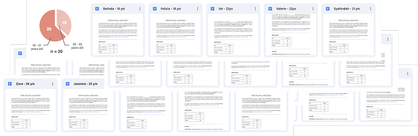
To understand the preferences of young women aged 18 to 25, we conducted a user research study with 30 participants (20 in the 18 to 21 age range and 10 in the 22 to 25 age range) recruited from polytechnic students to ensure diverse perspectives. Each session was a 10 to 15 minute survey designed to surface purchasing behaviours, brand preferences, and attitudes toward loyalty and digital tools.
30 interview transcripts
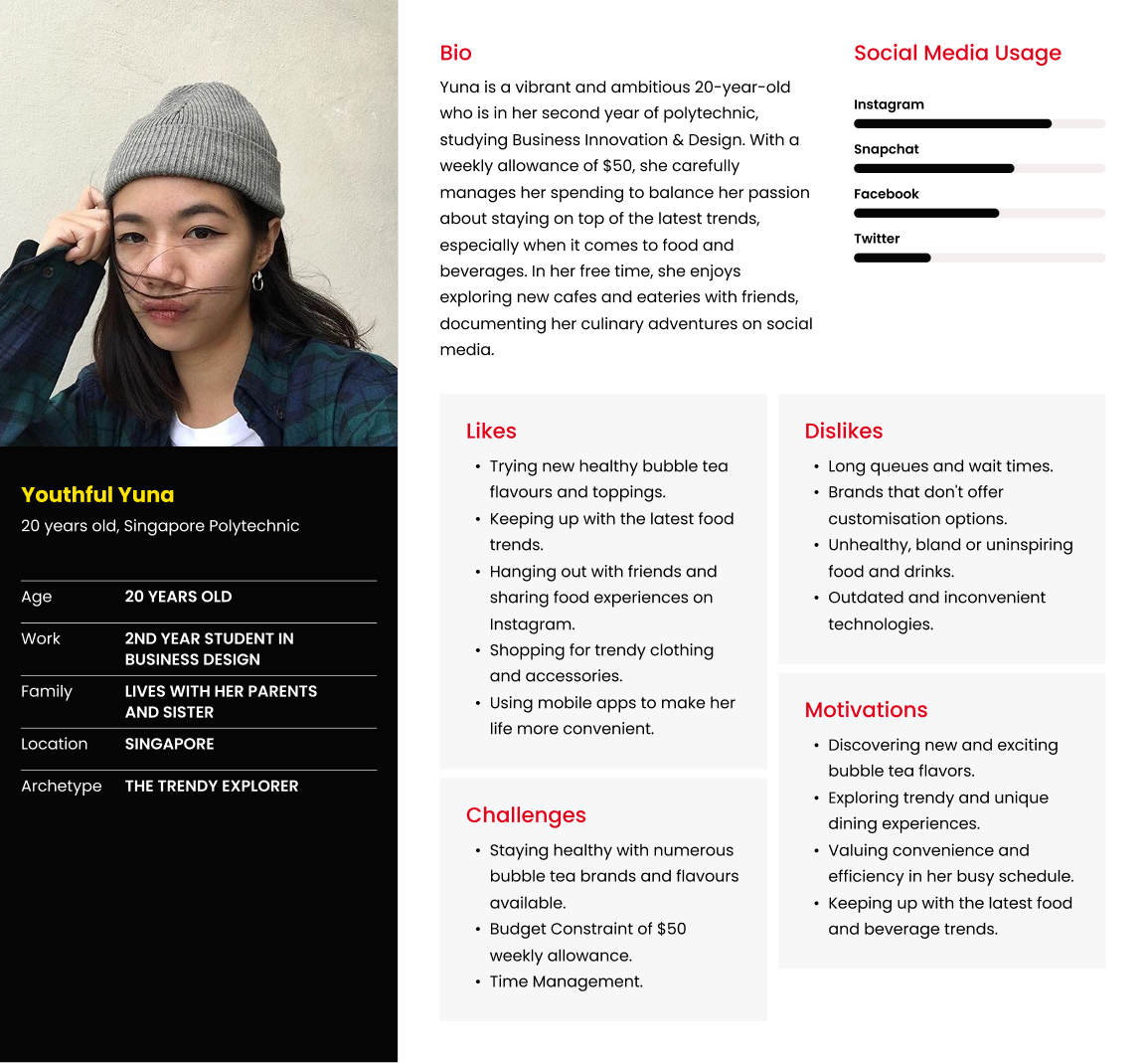
User persona defined from research — the representation of the ideal LiHO customer that guided every design decision across the 7 touchpoints.
Insight 1: Promotions are the primary purchase driver
68.1% of respondents said they looked for promotions when deciding where to buy bubble tea. This meant LiHO’s growth strategy had to go beyond product quality. It needed a visible, accessible rewards mechanism that gave this audience a tangible reason to choose LiHO over competitors.
Insight 2: A digital channel was missing but wanted
77.2% of respondents said they would use a LiHO app if one existed. The brand had no mobile presence at the time, which meant a key opportunity to engage and retain customers. Young consumers in this demographic expected to interact with food and beverage brands through their phones for ordering, rewards, and discovery.
Insight 3: The brand experience was fragmented across touchpoints
There was no consistent thread connecting how a user first discovered LiHO, how they ordered, and how they came back. To build meaningful engagement with this demographic, the brand needed a connected experience that moved users from awareness through to habit.
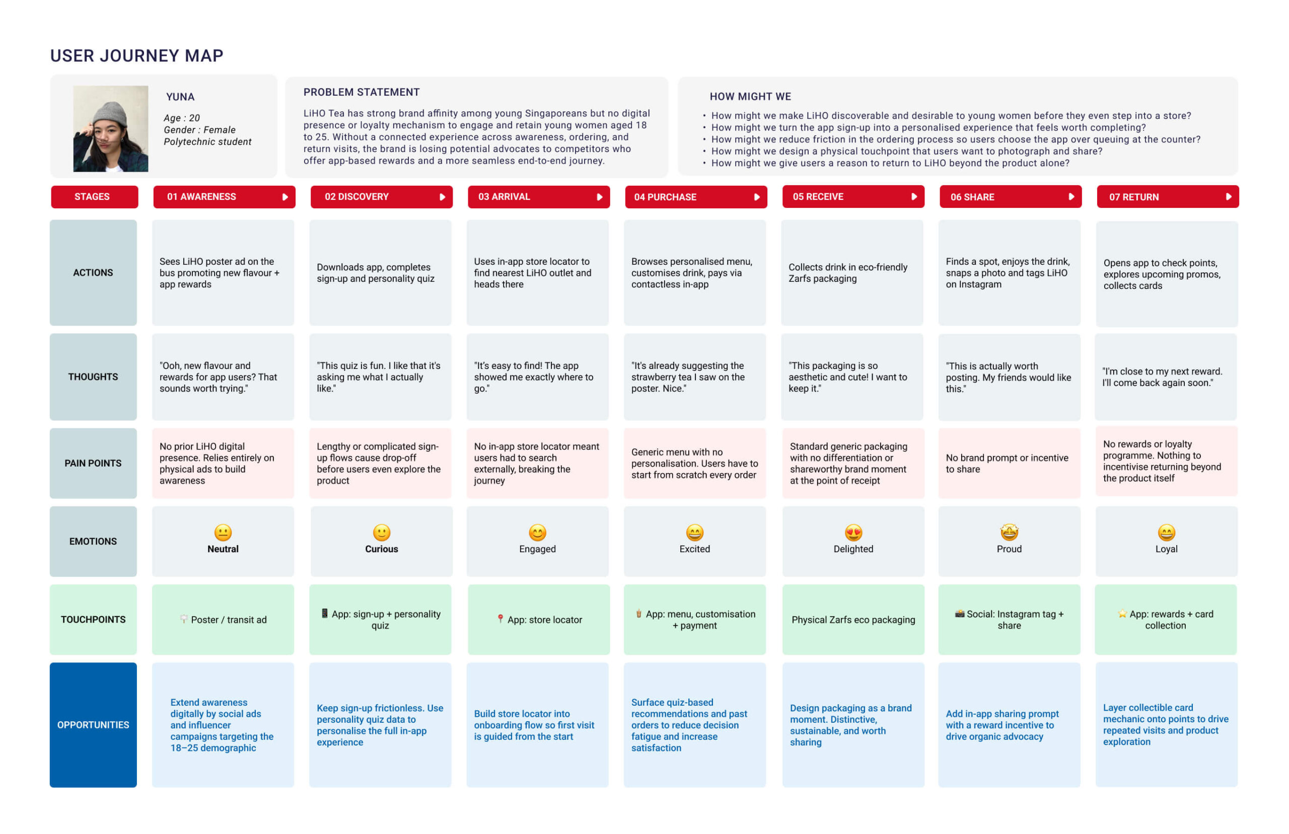
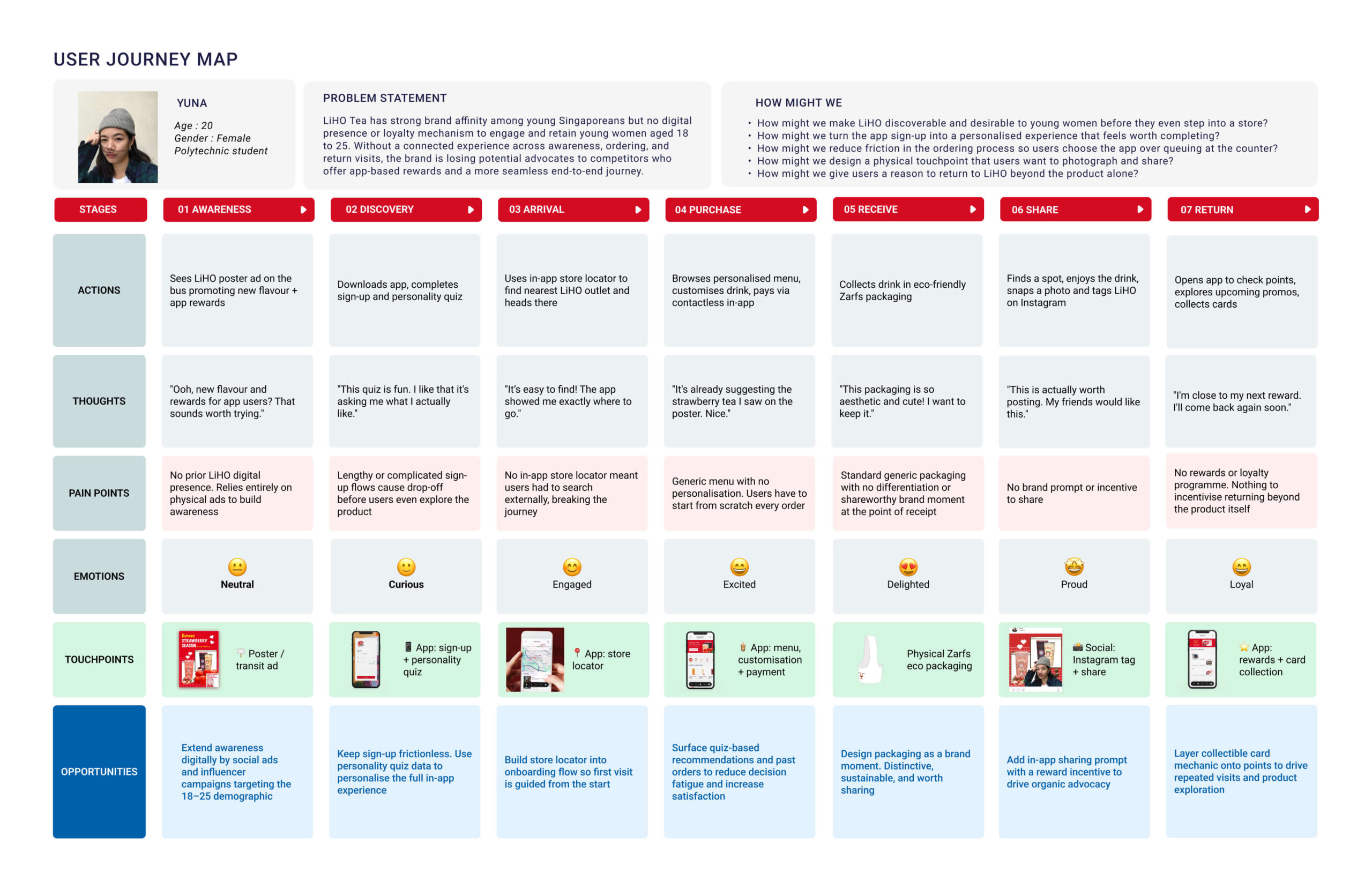
The 7-touchpoint customer journey map — built from research insights and used as the foundation for every feature and interaction designed for the LiHO app and brand experience.
Key Design Decisions
Decision 1: Map the full journey before designing any screen
Rather than jumping straight to app screens, the team first built a complete customer journey map covering every touchpoint between the user and the brand. From first noticing an advertisement to collecting rewards after their visit. This gave the design work a clear narrative: every feature and interaction had to serve a specific moment in the user’s journey. It also made it easier to identify gaps such as the pain points and design opportunities.
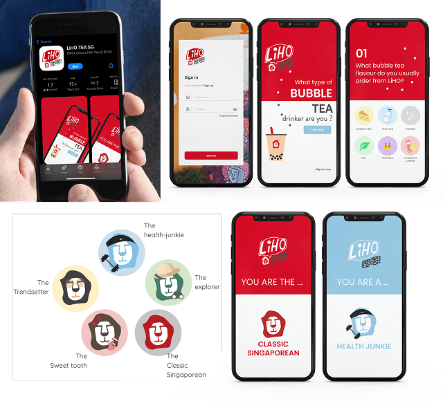
Decision 2: Personality quiz at onboarding to personalise from the start
What we chose: A personality quiz as part of the app sign-up flow, before the user places their first order.
What we considered: A standard sign-up with no personalisation layer.
Why this: Research showed this demographic expected brands to understand their preferences. A personality quiz gave LiHO the data to make relevant product recommendations from the very first session and gave users a reason to engage with the app beyond just ordering. It made the onboarding feel like the start of a relationship rather than a registration form.
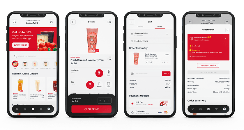
Decision 3: App-first ordering with contactless payment
What we chose: Mobile ordering with contactless payment as the default.
Why this: 77.2% of respondents said they would use a LiHO app. Designing the ordering experience around the app made it a useful channel for ordering and personalised recommendations, rather than just a marketing tool.
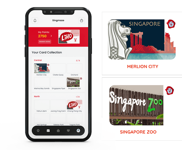
Decision 4: Rewards and a card collection mechanic to drive return visits
What we chose: A points-based rewards system combined with a collectible card mechanic within the app.
Why this: Promotions were the primary driver of purchase decisions. A rewards system directly addressed this but a card collection layer added something the research pointed to: a sense of fun and progress that aligned with how this demographic engaged with digital experiences. Points alone are transactional. A collection gives users something to complete, which is a stronger driver of repeated visits.
Decision 5: Packaging as a brand touchpoint
What we chose: LiHO’s eco-friendly Zarfs packaging was included as a deliberate touchpoint in the journey map. It creates a moment of brand expression between receiving the drink and sharing it.
Why this: For a demographic that shares experiences on Instagram, the physical product is also content. Sustainable, distinctive packaging gives users something worth photographing and sharing. Which can extend LiHO’s reach organically beyond paid advertising.
The Solution
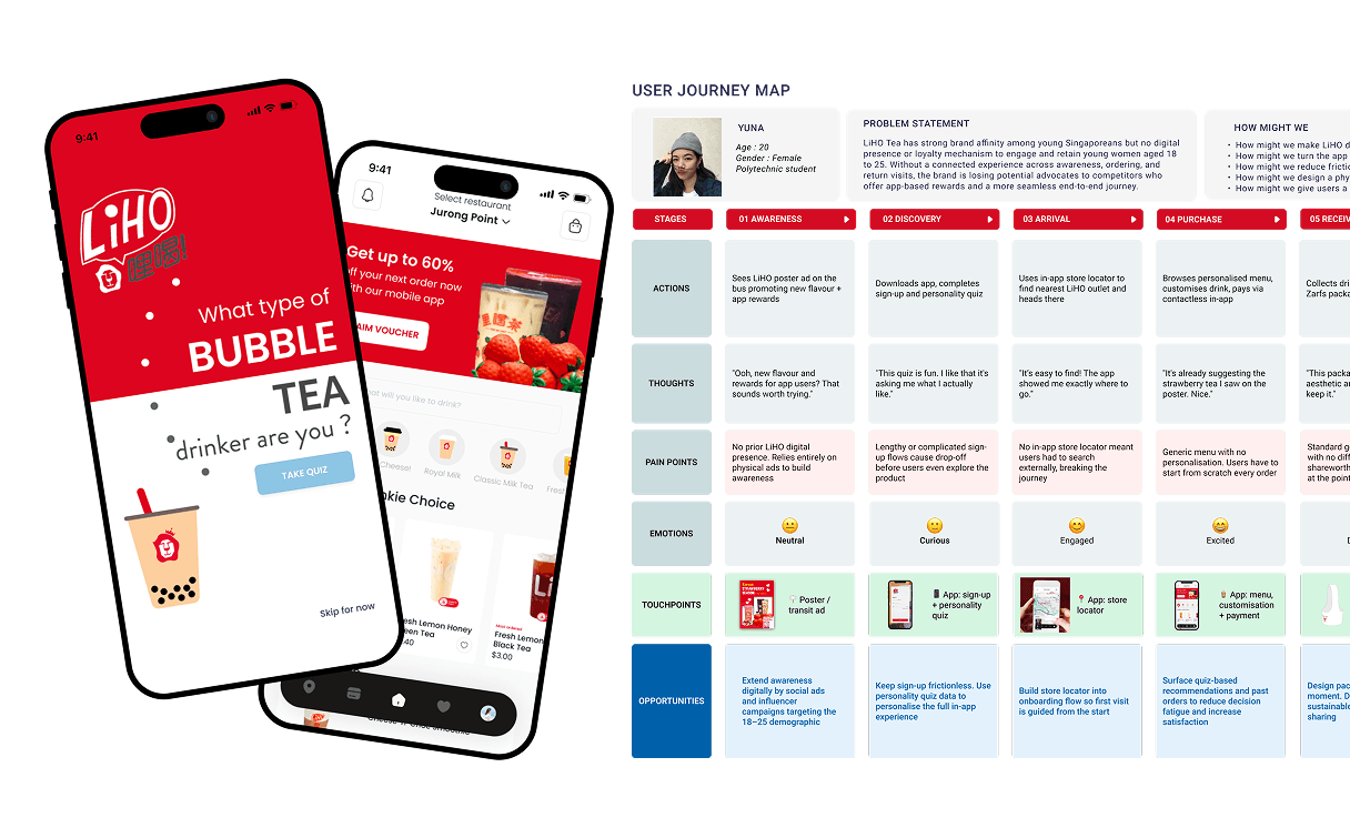
The team designed a connected brand experience across 7 touchpoints, anchored by a mobile app that served as the thread running through the full customer journey.
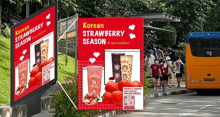
Touchpoint 1: Poster advertisement — a vibrant in-transit ad promoting a new flavour and exclusive app rewards, designed to reach the demographic during commute time.
Touchpoint 2: App download and onboarding — a seamless sign-up flow with a personality quiz to gather preferences and personalise the experience from the first session.
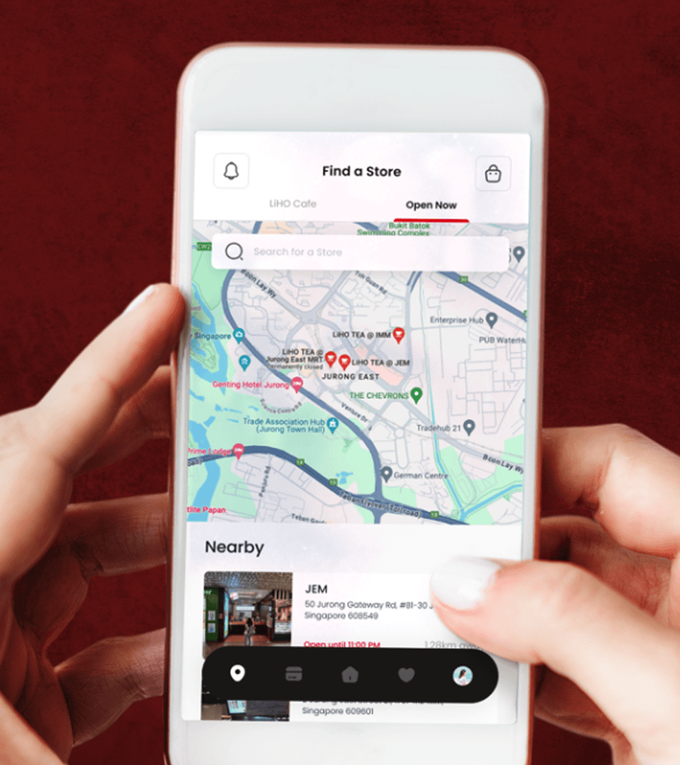
Touchpoint 3: Store discovery — in-app store locator enabling users to find the nearest LiHO outlet from the moment they decide to visit.
Touchpoint 4: App ordering with contactless payment — personalised menu recommendations based on quiz results and past orders, with contactless payment as the primary checkout path.
Touchpoint 5: Eco-friendly Zarfs packaging — distinctive, sustainable packaging designed as a shareable, photograph-worthy brand moment.
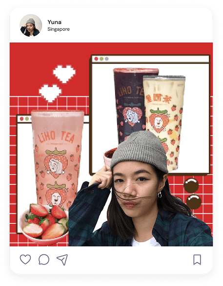
Touchpoint 6: Share and advocate — post-visit Instagram sharing as an organic extension of the brand experience, driven by a product and moment worth capturing.
Touchpoint 7: Rewards and card collection — Promotions drove 68.1% of purchase decisions. An ongoing engagement through points and a collectible card mechanic gave users something to complete and a reason to return.
Outcome
The customer journey map and brand strategy were presented to the LiHO founder and received enthusiasm and support. The 7-touchpoint proposal gave the founder a concrete, research-backed framework for growing LiHO’s engagement within the 18 to 25 demographic which helped identify tangible avenues for investment rather than broad brand recommendations.
Results: • 7 brand touchpoints designed across the full customer journey • 30 research participants across two age groups • 77.2% of respondents said they would use a LiHO app • 68.1% of respondents cited promotions as the primary purchase driver • Founder sign-off strategy presented to and endorsed by LiHO’s founder
The future-state customer journey map — 7-touchpoint designed for the LiHO app and brand experience.
Founder sign-off strategy presented to and endorsed by LiHO's founder
Reflection
This project taught me the value of designing the journey before designing individual screens. The customer journey map became the framework for making design decisions and answering questions about which touchpoint each feature supported and what users needed at that moment.
If I did this again, I would test the concept before the founder presentation, especially the personality quiz and card collection mechanic. Both were based on research insights rather than direct validation. Testing with even 5 users from the target demographic would have strengthened the recommendation. While time constraints made this difficult as a student project, I would consider concept testing an essential step in a professional setting.