zuCRM 0 to 1 Custom CRM & Project Management Platform
Designed zuCRM, a 0→1 custom CRM and project management platform for Techzu, leading UX/UI strategy from brief to developer handoff across 5 core modules and 26 screens with a unified design language built from scratch.
Techzu’s clients were managing customer relationships in spreadsheets, tracking projects in disconnected tools, and losing deals to slow follow-ups and no clear pipeline visibility. Existing solutions like Pipedrive or ClickUp each solved part of the problem, but not both at once.
Techzu needed a custom platform that combined CRM and project management in a single product. The brief covered a wide surface area: manage internal projects, track customer interactions, handle sales pipelines, run live chat support, manage a product store, and close deals faster all in one place.
The design challenge was not just building all of that. It was making it feel like one product rather than eight disconnected features in one platform. With no existing screens to iterate on, no inherited design system, and no prior version to reference, every structure, pattern, and interaction had to be decided from scratch.
My Role
I was the lead product designer for zuCRM, working closely with the Techzu sales lead to translate business goals into product structure, and with the development team to ensure every feature and interaction was implemented correctly. My role covered the full product lifecycle. From defining the information architecture and establishing the design language, to designing all 5 core modules end-to-end, and closing the gap between design intent and delivered product. There was no UX research team and no existing system to inherit.
Discovery
Because this was a business-led 0-to-1 build, discovery was conducted through direct working sessions with the Techzu sales lead, who had firsthand knowledge of where client workflows broke down and what existing platforms are lacking.
Insight 1: Clients needed CRM and project management in one place
The problem was not just that clients used two separate tools. It was that switching between them caused context loss. A sales rep handling a customer enquiry had no visibility into that customer’s open tasks or purchase history without navigating elsewhere. The product needed to hold customer data, deal tracking, project management, and live communication together.
Insight 2: The sales pipeline was the highest-priority workflow
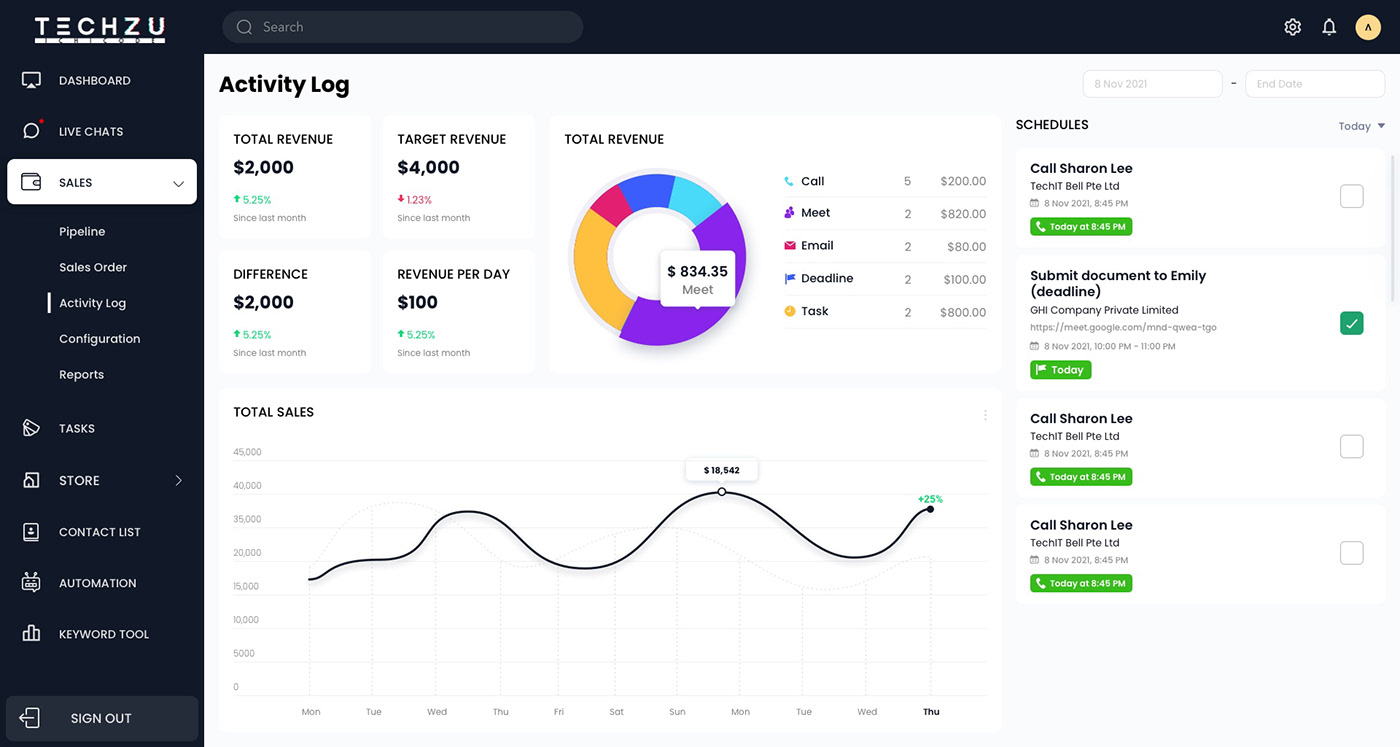
Most client friction happened in the sales process: leads going cold, unclear deal stages, no visibility into activity or revenue performance. The Sales module needed to be the most structured part of the product (with sub-sections like Pipeline, Sales Order, Activity Log, Configuration, and Reports) giving teams a complete view of where deals stood and how revenue was tracking.
Insight 3: The product needed to feel simple despite covering significant ground
With 8 modules covering very different functions, the risk was a cluttered product that tried to do everything and felt overwhelming. Navigation, hierarchy, and information density all had to be managed so users could orient themselves quickly and find what they needed without the system feeling like an enterprise ERP.
Key Design Decisions
Decision 1: Define the IA before any screen design
With 8 modules covering CRM, project management, sales, live support, store management, and automation, the first design decision was structural: how do these modules relate to each other, and what does the navigation hierarchy look like?
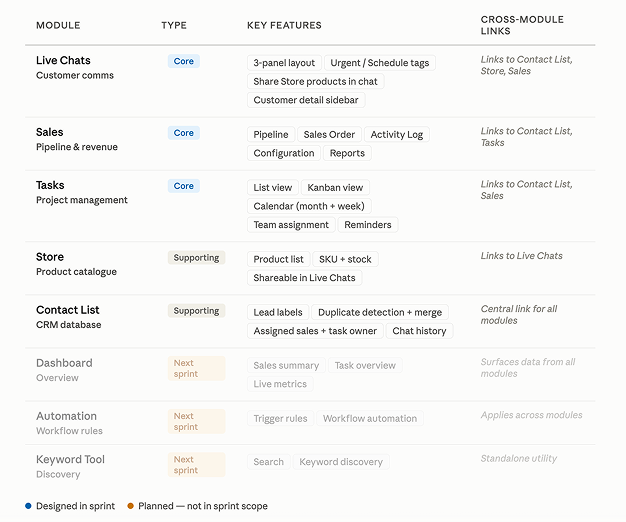
I mapped the modules by feature type and workflow dependency.
Core modules: Dashboard, Live Chats, Sales, Tasks
Supporting modules: Store, Contact List, Automation, and Keyword Tool
Decision 2: Cross-module integration as a product principle, not just a feature
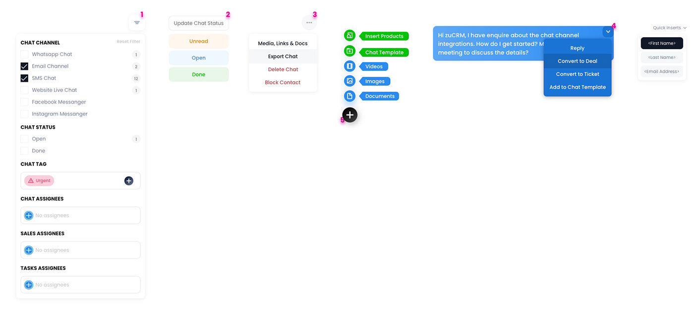
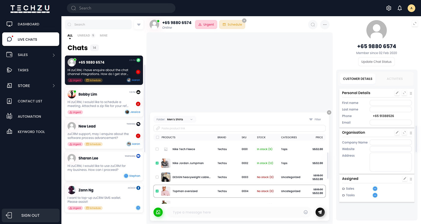
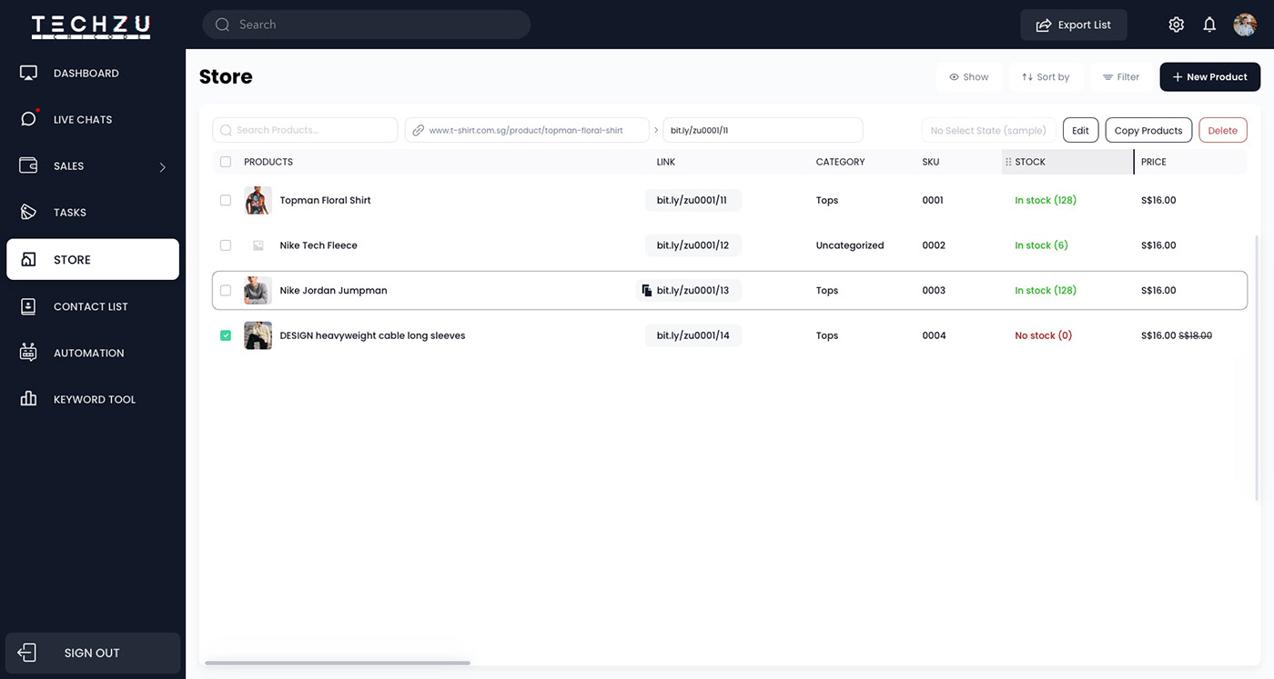
What we chose: Modules that work together. The clearest example was enabling agents to browse and share Store products directly within a Live Chat conversation, without leaving the chat interface.
What we considered: Each module as a self-contained section the user would navigate to independently.
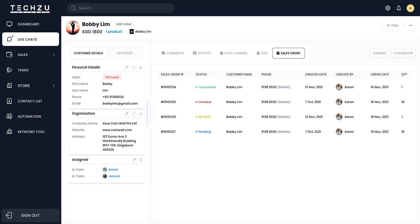
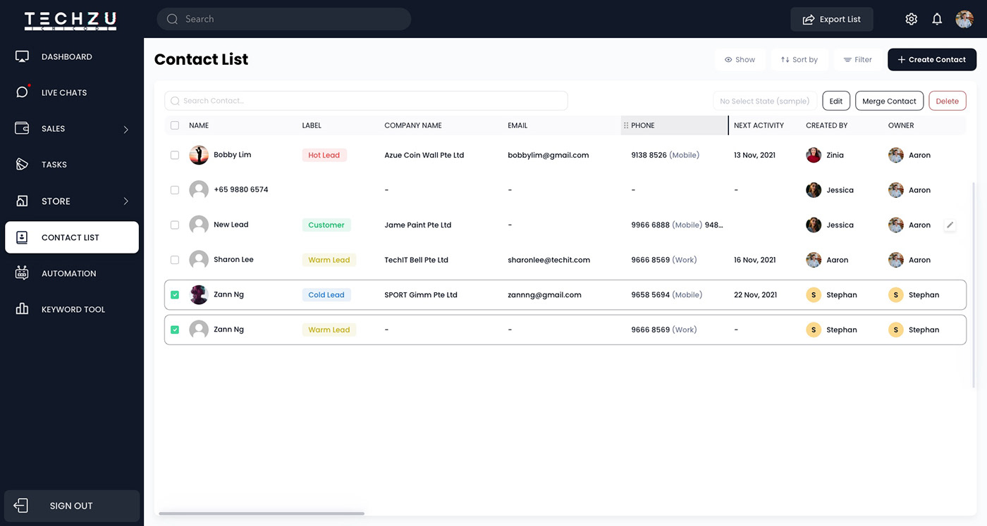
Why this: The product’s value was not just having CRM and project management in one place, it was having them connected. A sales agent handling an incoming chat enquiry should be able to pull up a product from the Store and share it in that same conversation without switching context. The same principle shaped the Contact List, where each contact record is linked to their chat history, assigned sales rep, task owner, and sales order. Every module surfaces relevant context from the others. This cross-module integration was what made zuCRM feel like one product rather than separated features.
Decision 3: Tasks designed for multiple working styles
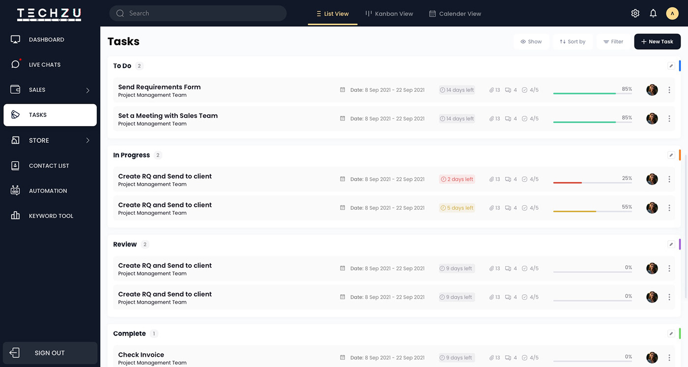
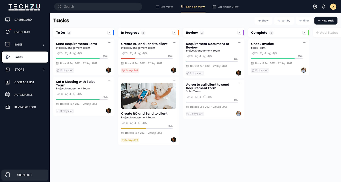
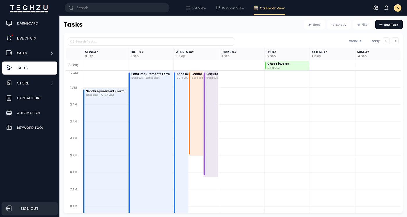
What we chose: Three views for the Tasks module: List, Kanban, and Calendar (with both Month and Week modes).
What we considered: A single default view.
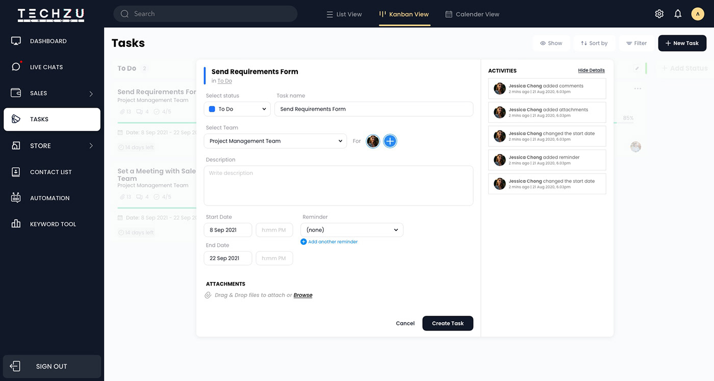
Why this: Different team members manage work differently. A project manager tracking sprint progress wants a Kanban board. A team member tracking deadlines across the week wants a calendar. Designing all three views using the same underlying data model meant users could switch between them without losing information.
Decision 4: Establish the design language in the first module
With no inherited design system, the visual language had to be defined early and applied consistently. I set the foundational decisions during the first module and carried them through the full product: dark navy sidebar, white content canvas, table and card patterns, status indicators, label system, action placement.
Consistency reduced the cognitive load of moving between modules, and it made developer collaboration significantly faster.
Decision 5: Embed directly in the development process
Because there was no formal QA or dedicated handoff stage, I worked alongside the development team throughout the build. Which means reviewing implemented screens against designs, flagging behaviour gaps, and resolving unexpected issues. This continuous design-development collaboration kept the product consistent from first screen to final delivery.
The Solution
zuCRM was delivered as a fully connected custom product built across 8 modules:
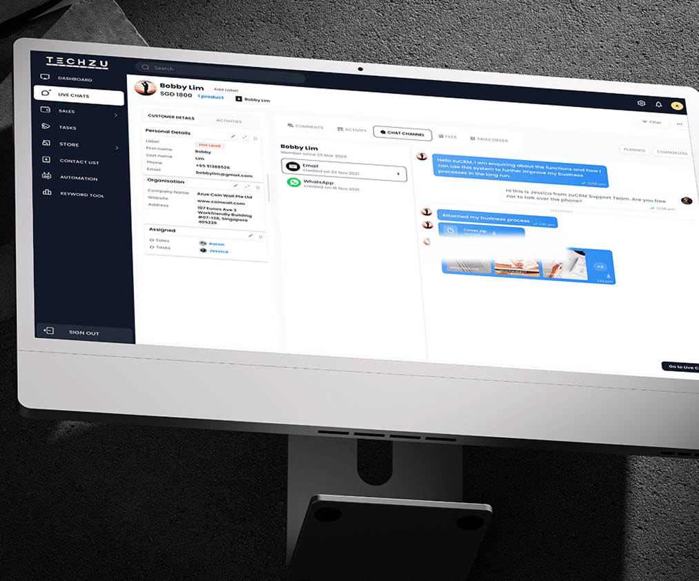
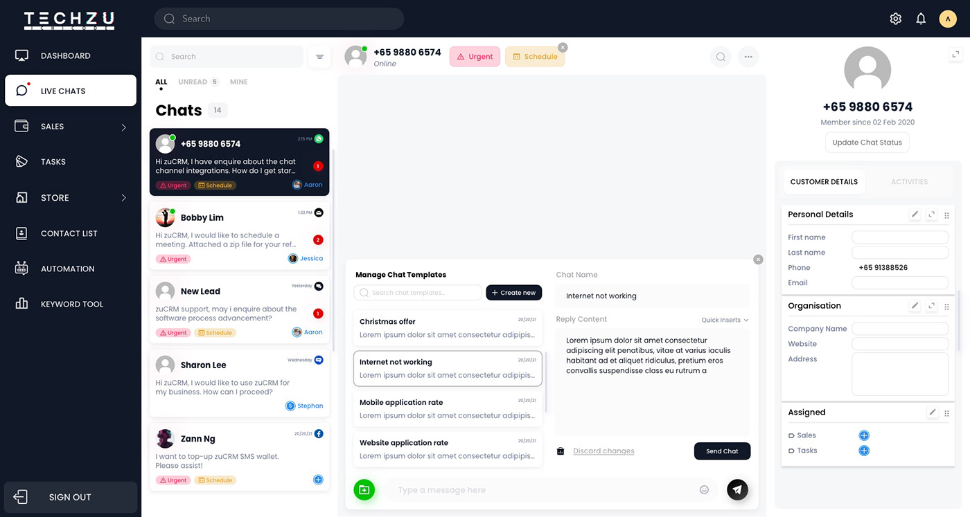
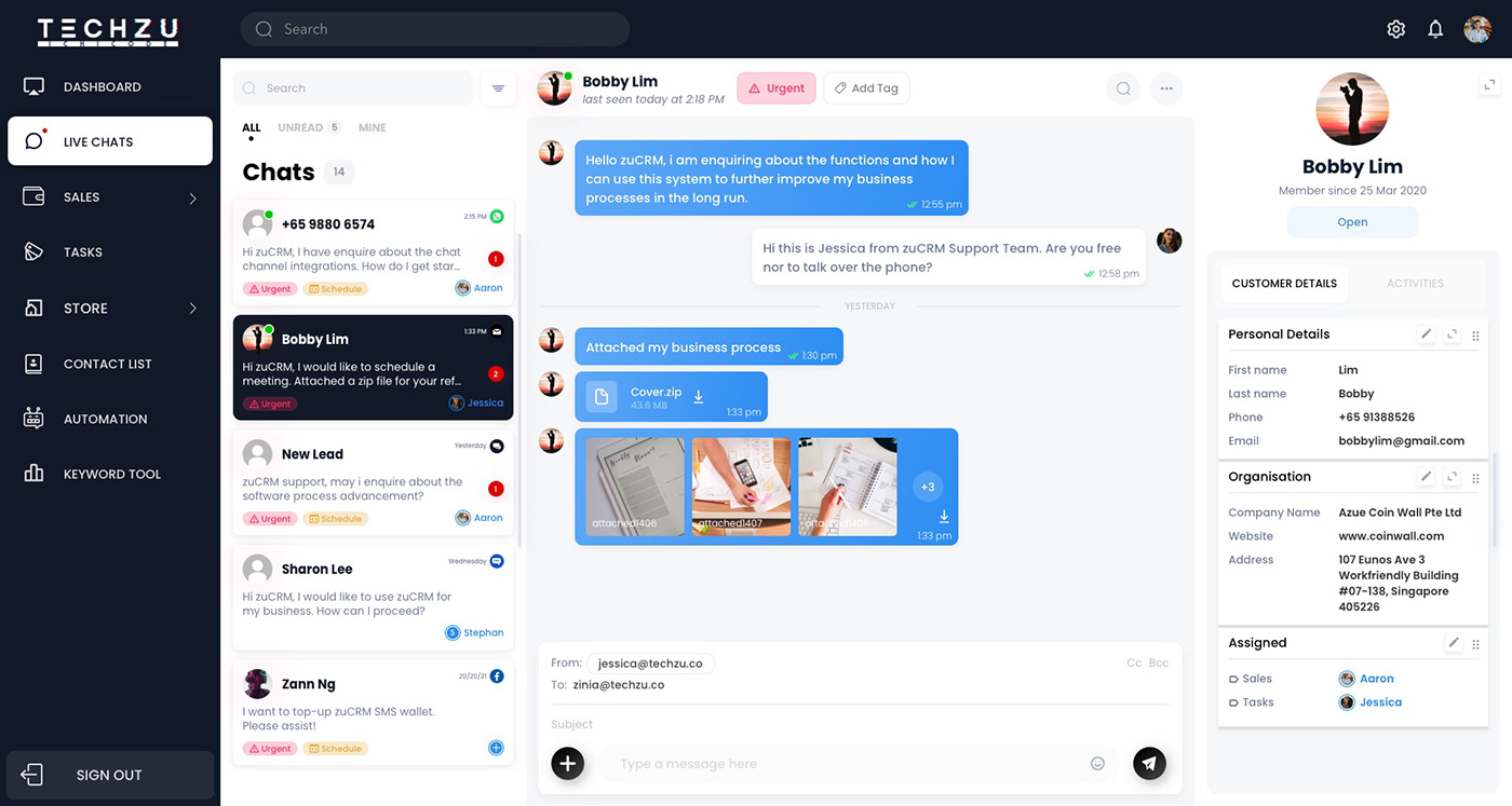
Live Chats — 3-panel layout: chat list, active conversation, customer detail sidebar.
Live Chats — Agents can share Store products directly in chat. Tags (Urgent, Schedule) for conversation management.
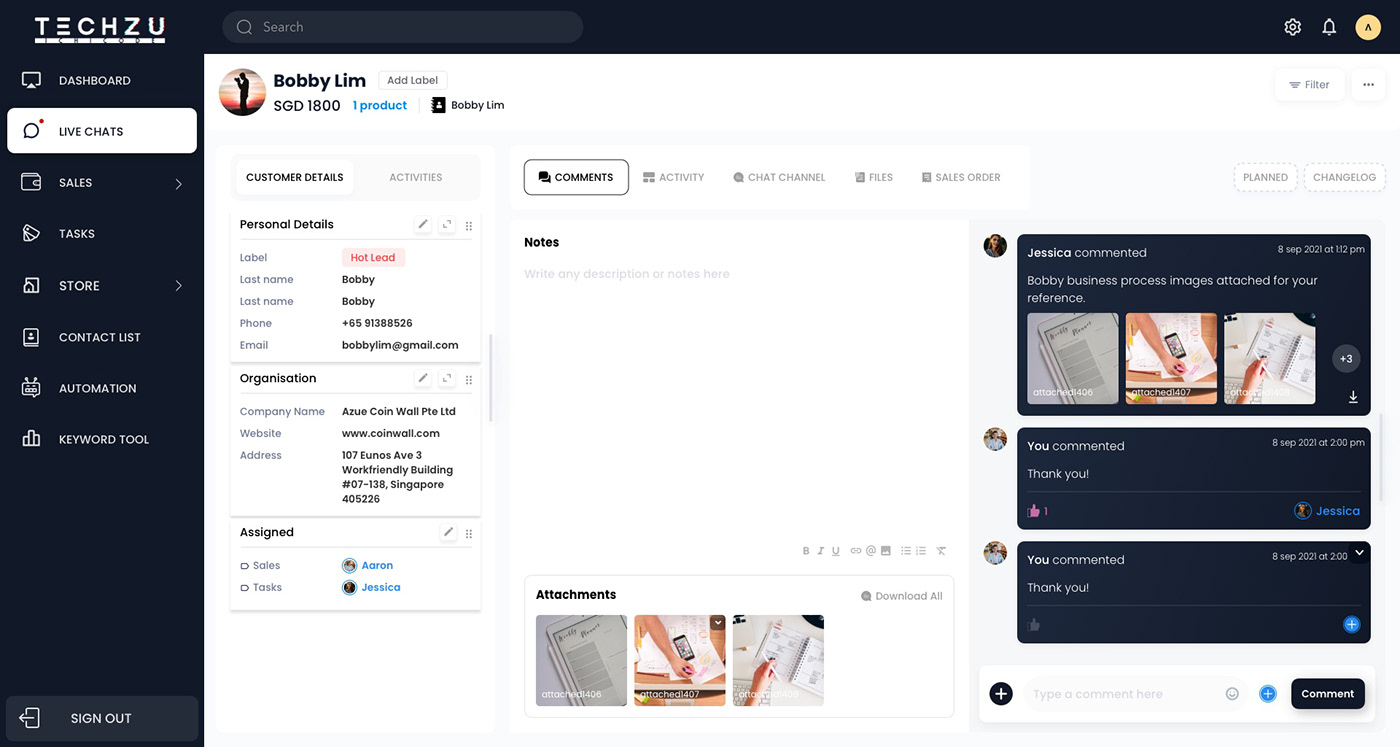
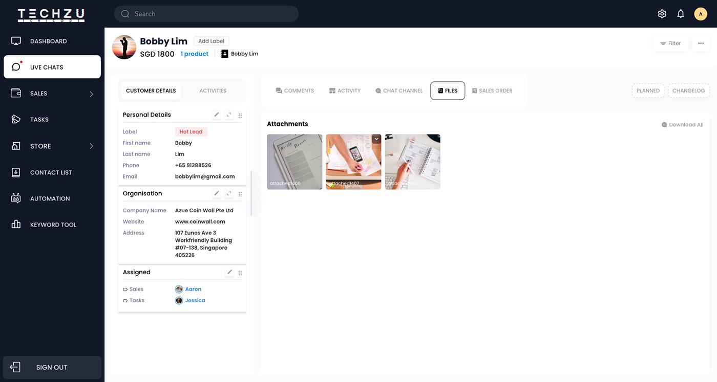
Live Chats — Expand customer details: all tracked history of comments, activities, chat, files, etc.
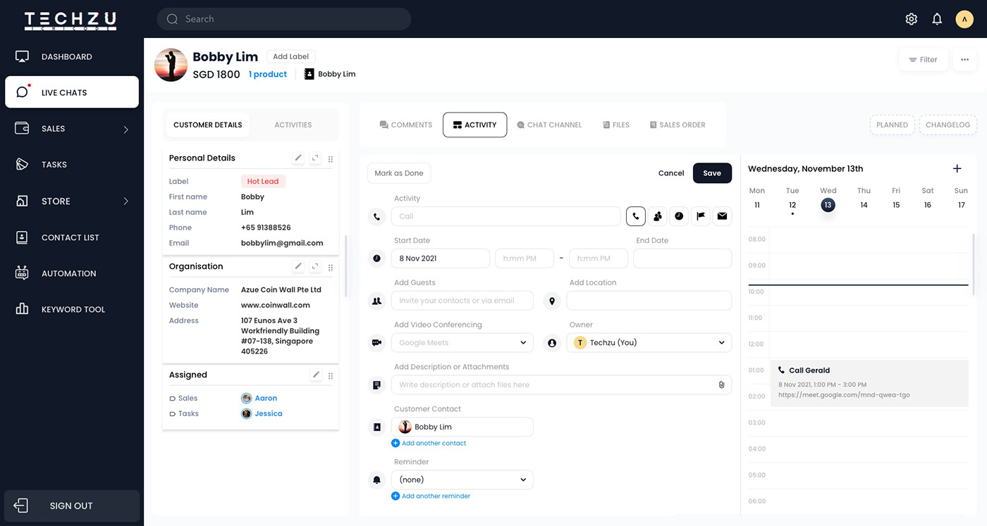
Live Chats — Schedule activities
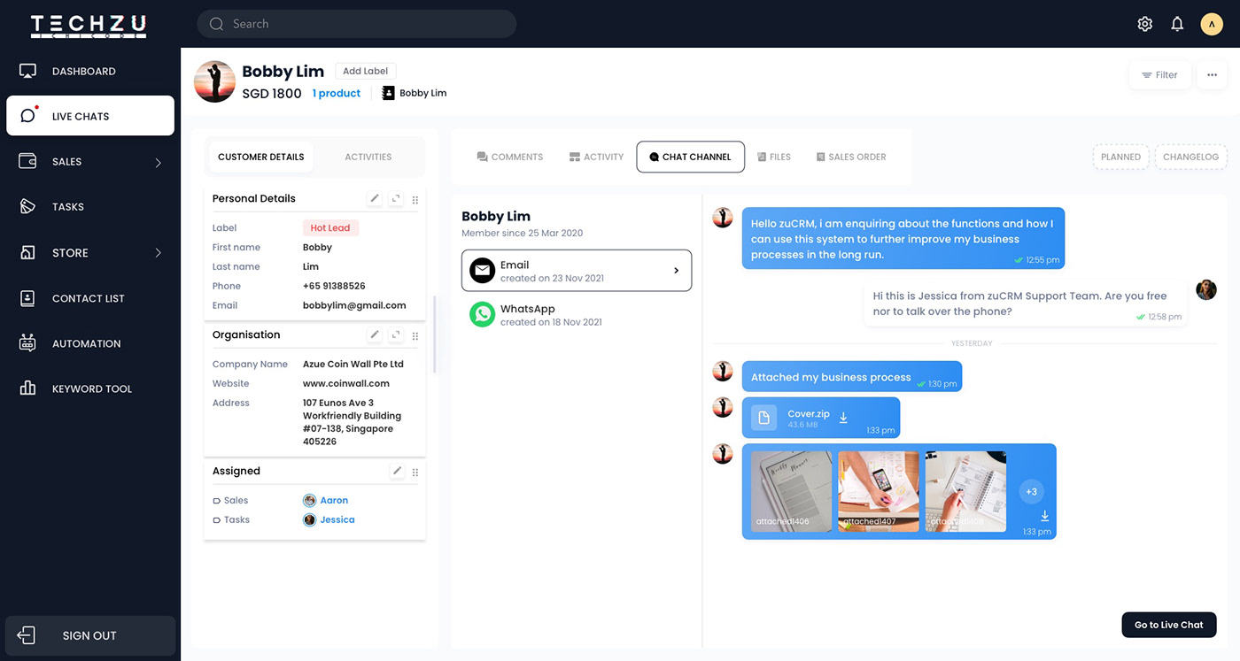
Live Chats — Chat channel: a centralised chat channel instead of separated chat platforms.
Tasks — List, Kanban, and Calendar views. Task detail includes status, team assignment, start and end dates, reminders, attachments, and activity log.
Tasks — Create task detail modal.
Store — product table with link, category, SKU, stock level, and price. Directly accessible from Live Chats during a customer conversation.
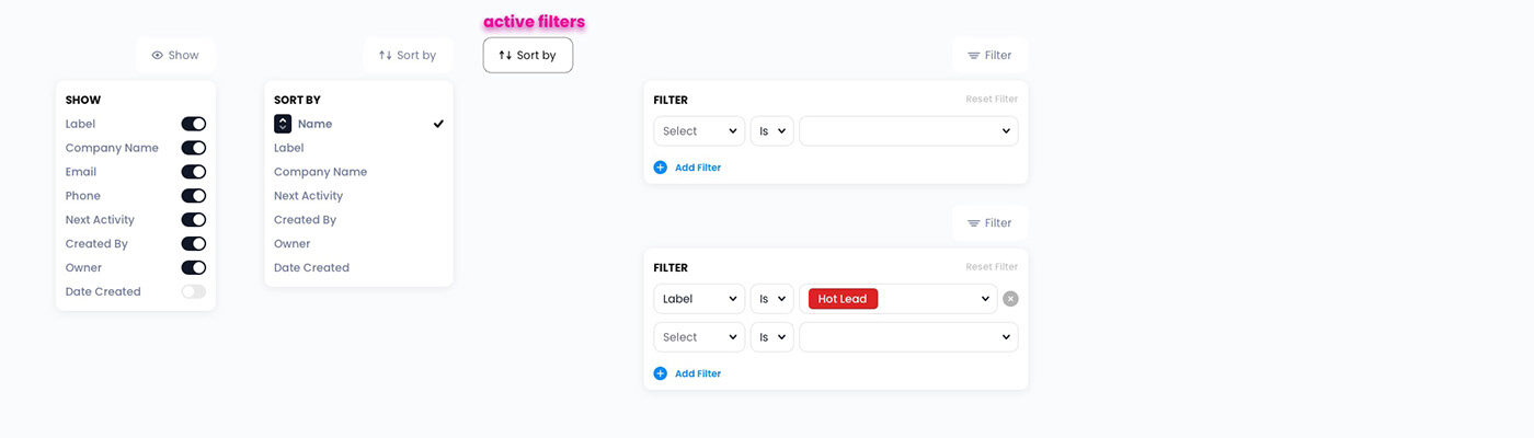
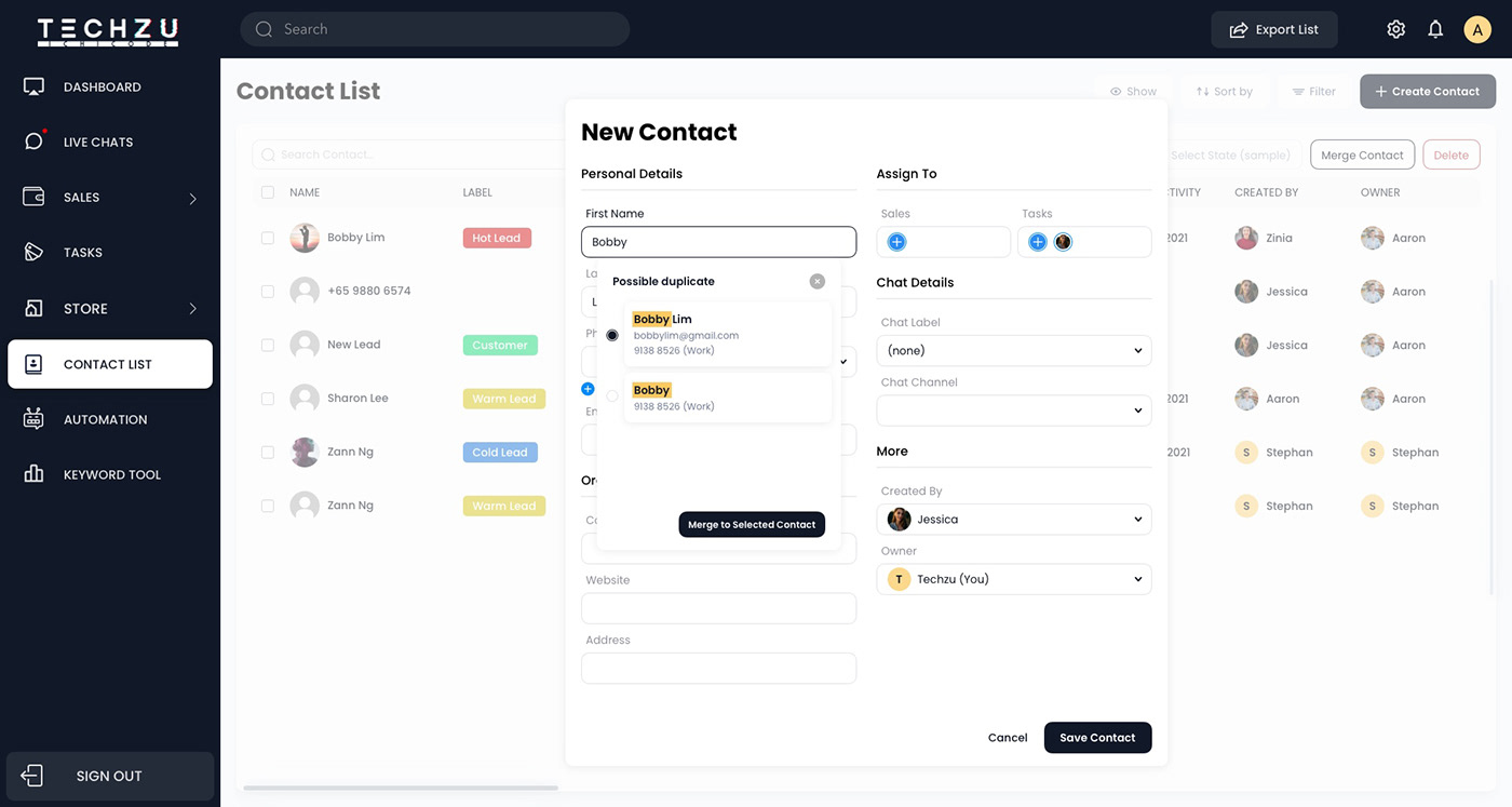
Contact List — centralised customer database with lead labels, company details, assigned sales rep, task owner, and next activity.
Contact List — Create new contact modal and name duplicate detection.
Outcome
zuCRM was designed and shipped as a custom product from scratch, with 5 connected core modules and no existing design system, previous version, or template to build from.
Results: • 5 core modules designed end-to-end • 26 dashboard and feature screens delivered • 0 → 1 full product build from brief to developer handoff • 1 custom design language established and applied across the full product
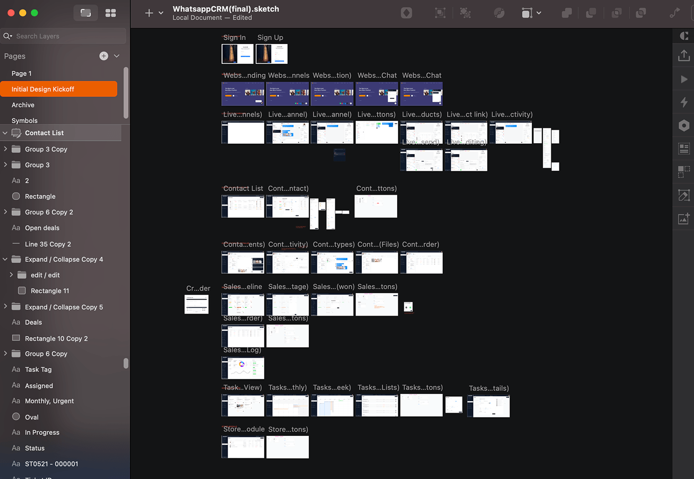
A bird's eye view of the full zuCRM design source file
Collaborated with the sales and development team to shape how zuCRM helps businesses manage CRM and project management.
Reflection
Building a 0-to-1 product without user research was a calculated risk. We relied on business knowledge and the sales lead’s understanding of client pain points, which kept the project moving and grounded in real workflows. But it also meant our decisions were based on limited perspectives.
Some cross-module features, like sharing Store products directly in Live Chats, made sense on paper but would have benefited from usability testing. These are the kinds of interactions that are difficult to validate through internal reviews alone.
Next time, I would push for even a lightweight round of testing with 3 to 5 target users. Watching someone use the product for the first time can quickly reveal friction we would otherwise miss. For me, that is the difference between designing something that looks right and knowing it actually works.
One thing that worked well was the speed of alignment with the Techzu sales lead. Because I understood the business requirements quickly and came to each working session with a clear design rationale, the feedback loop stayed tight and decisions were made without unnecessary back-and-forth. That, combined with solid design foundations established early, meant the product moved from brief to handoff faster than a typical 0-to-1 build. Stakeholder confidence in the design direction meant less revision time and more building time.